
Used as
-
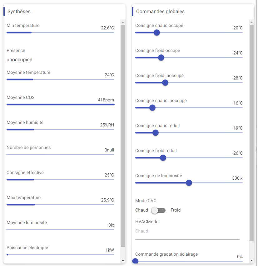
Card
Summary
Display a specific editor for each control:Point or baja:StatusValue or baja:Simple (not all are supported).
Implementation
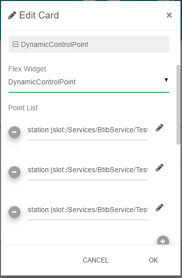
There are two ways to add it to the FlexView:
-
Add a card from the settings bar, and choose in the list DynamicControlPoint.
-
Or drag&drop it from the palette
-
To add points or slots to control, you have two different methods:
-
Drag&drop the points or components from the station into the PointList field, the ord will be set automatically. Change the ord if you want to target a specific slot of a component
-
Select a Selection which targets components (like points)
-
-
Set the personalized properties
Facets
Those are the facets that are used in the Dynamic Control for each point type :
|
Numeric |
String |
Boolean |
Enum |
|---|---|---|---|
|
units
|
multiLine
|
trueText
|
range |
Since the units rely on the point, not the slot, it will only be displayed when the point is targeted, not the slot. Maybe in the future version off this card, the slot will display the unit of its parent.
Additional information on PriorityLevel
If the priority level selected is inferior to the active level, the editor is not editable unless you put the property AllowWriteAnyLevel at true.
Please note: the displayed value at the start is always the out the Point. When editing, it will edit the targeted priority level.
PriorityLevel in1, in8 are reserved in Niagara for ControlPoints, also in6 for BooleanPoints.
Flex Widget Properties
-
List: A list of control:Point or baja:StatusValue or baja:Simple to display (support drag&drop from the Navigation Tree).
(warning) If the user doesn't have read permission on a point it will be hidden and if he doesn't have write permission on a Writable point it will not be editable. -
Selection: A baja:Selection which targets a list of ControlPoint. Selection has a priority over the List.
-
Hyperlink: Whether to display or not an hyperlink for each point.
-
StatusInfo: Whether to display or not status info for each point ('ok' status is not displayed).
-
PriorityLevel: The priority level where to write on Writable points. Choose level na to force read only (refers to none).
-
AllowWriteAnyLevel: Allow to write on the priority level of the Writable points even if there is a value in an higher priority level.
-
NullToggle: Allows or not to set null Status of a StatusValue.
-
ShowOnlySlotName: Indicates whether the Component name should precede the slot name in the field label or not.
-
DefaultMin: default min value for number type.
-
DefaultMax: default max value for number type.
-
WidgetColor: The color for slider, switch and checkbox.