
Used as
-
Card
-
Sidebar
Summary
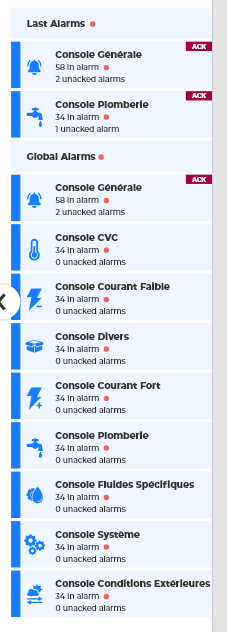
This Card displays a view divided into two parts:
-
A list of Alarm Consoles
-
A list of last alarms (using LastAlarm component from Toolkit)
Implementation
-
Add a card from the settings bar, and choose in the list AlarmSummary
-
Or drag&drop it from the palette
-
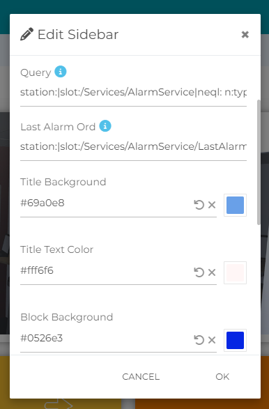
Define a query like this one: station:|slot:/Services/AlarmService|neql: n:type='alarm:ConsoleRecipient'
-
Set the LastAlarm ord to the LastAlarm component if you have one in your AlarmService
Alarm Console Icon
A custom SVG icon can be displayed for each Alarm Console.
To configure an icon:
-
Open the Slot Sheet of the
ConsoleRecipient -
Add a dynamic slot named
svgLightIcon -
Set its type to
baja:Ord -
Set
svgLightIconto the Ord of the SVG resource you want to display
Example:
module://linksperUi/resource/images/icon/alarmConsoles/HVAC.svg
When svgLightIcon is configured, the corresponding SVG icon is displayed next to the Alarm Console in the AlarmSummary.
Tips: You can add it as a SideBar in the FlexView so it can easily hide or appear in the general view
Flex Widget Properties
-
Query: Ord to resolve the list of console recipient (allows sFormat)
-
Last Alarm Ord: Ord to resolve the LastAlarm component that have the LastAlarmItems (allows sFormat)
-
Title Background: Color of the Title background block
-
Title Text Color: Color of the texts in the Title block
-
Block Background: Backgroung color of the blocks
-
Block Text Color: Color of the texts in the blocks
-
Border: Color of the pad to the left of the block
-
Icon Color: Icon Color