Description
The FrameLayout is a template for the flexView. It adds a side menu that allows to navigates through different FlexViews, or Niagara views.
.png?cb=08cd847774a54dd376a81f9e0659aa6e)
Implementation
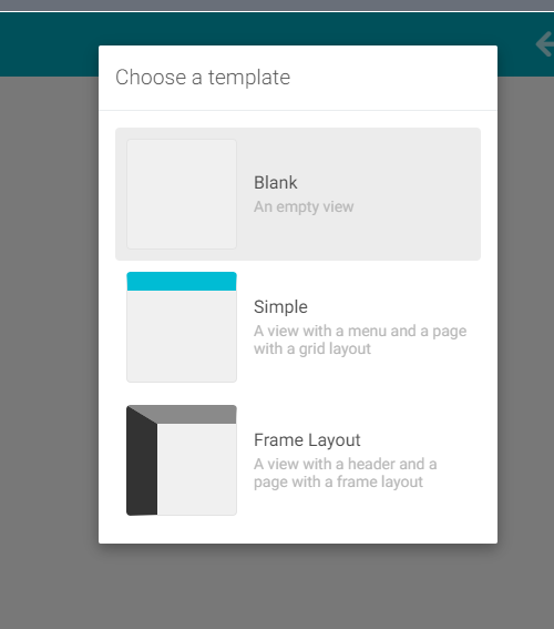
When creating a FlexView, you will have to choose between three templates
-
Blank: a FlexView without any predefined card or menu.
-
Simple: a simple FlexView with a MaterialMenu.
-
FrameLayout: a FlexView with a side panel and an ActiveHeader. See below for further details.
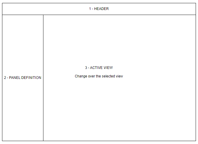
The FrameLayout template is divided into three parts:
-
The Header: a customizable ActiveHeader.
-
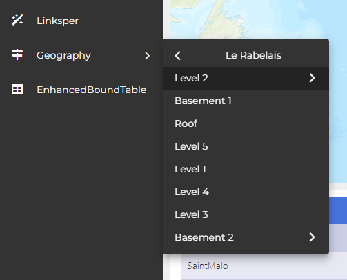
The PanelDefinition: a list of navigable items.
-
The active view: the displayed view selected in the PanelDefinition.
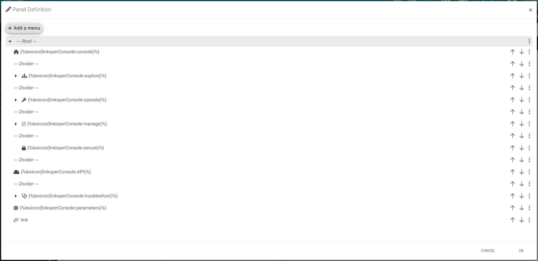
To Edit the PanelDefinition:
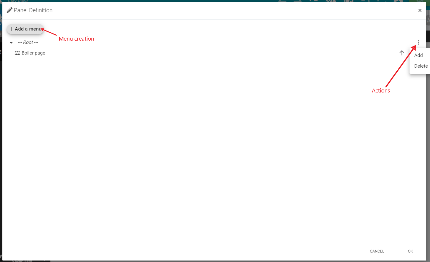
Like the FlexView, start editing by clicking the pencil button 
You can now edit the PanelDefinition:
-
Select the pencil to edit the aspect of the panel. Such as size, colors, etc.
-
Select the sitemap to add items to the PanelDefinition
To add a new Item to the Root of the pane, go to the action list by clicking to the three dots on the right side.
Three actions are possible:
-
Add a new Item (only for the Root, Containers and Hierarchies)
-
Edit an item
-
Delete an Item
You could also add a new menu to the FrameLayout, but only two types of item are authorized: Container and Hierarchy.
Here is the list of panel types:
V2
Version 2 of framelayout adds a number of graphical updates for a more modern, streamlined user experience.
-
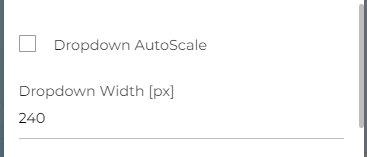
Dropdown AutoScale : Displays all menu and sub-menu names when checked with Max Width of the menu.
-
Dropdown Width : When Dropdown AutoScale is not checked, set the width of the drop menu.