General resources are heavily used with history interfaces. We want the interface to pick the right parameters automatically to avoid classic Niagara headache to create a chart. Remember something? (smile)
When we select "Hot water consumption", we want to end up with a column chart with a sum aggregation and in red (because it's hot) whereas a temperature should appear as green and as a Line Chart and with an average yAggregation.
All should be automatic and this is precisely the role of the General Resources in this case.
Basically we're going to add tags to points and histories to describe how charts should be built, which parameters it should use (aggregation, color, delta, .etc). Tags will depend on the assignation to the model. Each time we assign a point to the model, it will look for the right GeneralResource, according to a mapping with the model, and decide which tag it should add to the point and to the history.
The "consumption" example
A classic example. So, let's say a consumption should:
-
Be always represented as columns (or bars)
-
Have a computed delta (get the difference between two consecutive values)
-
Use a sum aggregation for the y axis (we want to sum the consumption per month when visualizing a year)
-
Have a color depending on the source (gaz should be purple, electricity yellow and water blue)
Open the General Resource folder
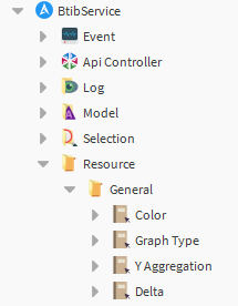
There are 4 main General Resources.
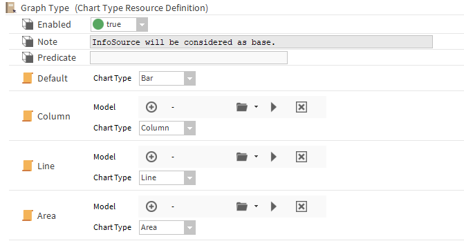
GraphType
We'll start with the Graph Type. Open the corresponding definition.
Enable the Resource Definition at the top.
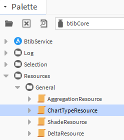
Then, from the btibCore palette (or btibElasticsearch palette), add three ChartType resources to the definition and name them:
-
Column
-
Line
-
Area
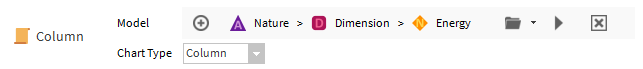
Add the Nature aspect if you want to play the same example, or choose your own Nodes otherwise.
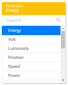
Select with the folder arrow -> Hierarchy chooser. Then select in the Nature hierarchy, in the Dimension folder, the "Energy" Node.
Then go to a point in your station.
-
Add an history extension if it doesn't have one yet.
-
Add an InfoSource from btibStructure
-
Assign the point to the Energy Node
-
Save the view
-
Check the tag in the InfoSource, in the point or in the HistoryExtension:
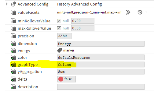
There is now a tag to define which type of chart should be used to show the history of this point.
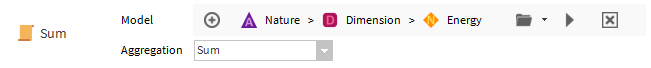
yAggregation
Repeat the same operation for the yAggregation.
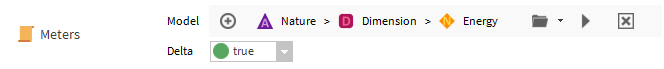
Delta
And for the delta
Color
Careful, we said we wanted blue for water, yellow for Electricity... So we need another mapping. So add a shadeResource from the palette.
Wait.... Why is it called a ShadeResource? When you want to display one consumption, one color is enough but when you want to show many "Electricity consumption", you don't want to show the same color. This is why we're defining a shade of colors. Define a couple of colors for the resource and create the mapping to Electricity. Then add a new resource for Water etc.
If you don't to bother so much, there pre-defined shades in the btibElasticsearch palette.
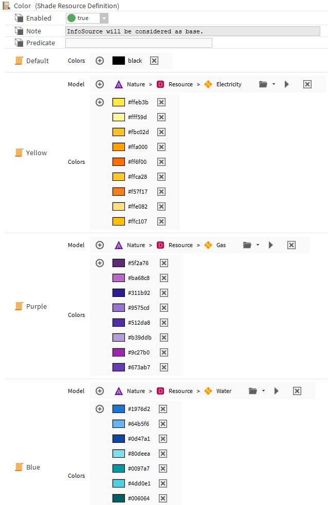
Then go back to the point and assign it to "Electricity". You will get the right tags.
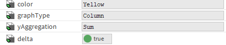
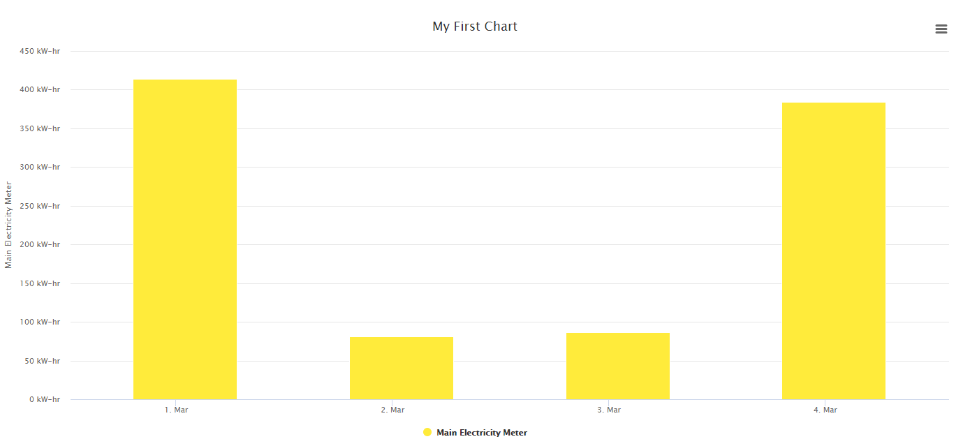
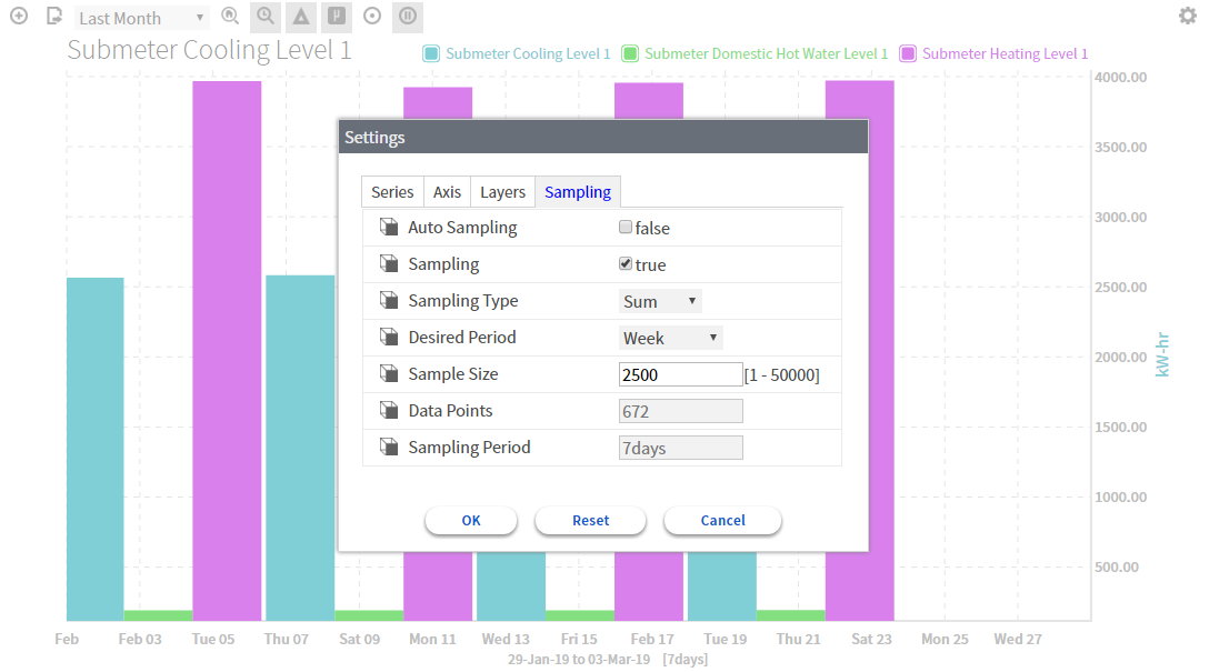
So when you display it in the ChartCreator or in a FlexPane card: