
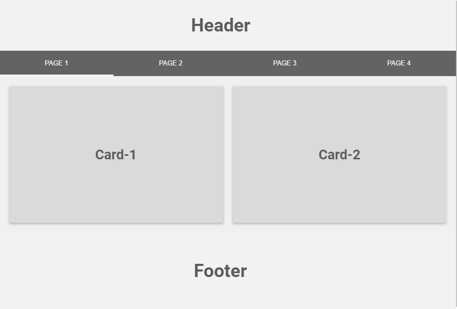
There are three main concepts around a FlexView:
-
A FlewView is organized with pages. You can add as many pages as you want.
-
A page contains cards. A card can represent a px view, a chart, a text, a component view etc.
-
To navigate between pages you can add a menu.
-
You can add a header. It will be common to all pages and located at the top of the menu
-
Or a footer.
Editing Mode versus Visualization Mode
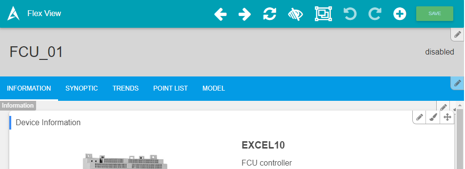
Exactly similar to the PxEditor experience, you can switch from the visualization mode to the edit mode using the "Edit Flex View" button on the top.
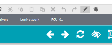
On the Editing Mode you can see a toolbar at the top and some buttons at the top right of each element:
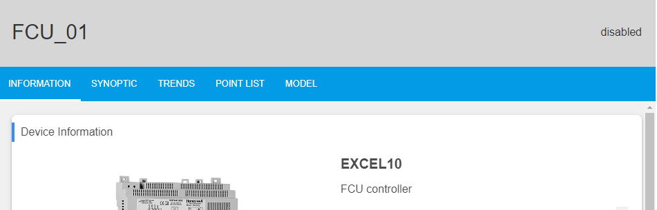
On the visualization mode, the toolbar and the buttons disappear:
If you want to hide the edit button to restrict user from editing the view, you need to remove permission for writing on the Program Service to the user.
You can have a look to this small tutorial to configure the permissions for a user Setup user rights - View mode only
The Settings bar at the top is only visible when you have specific writing user rights on the Program Service
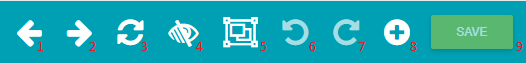
Settings bar
The settings bar will allow you to interact with the view
-
Previous: Go to the previous Page.
-
Next: Go to the next Page.
-
Refresh: Actualize the FlexView.
-
Show Hidden Elements: Allows to show hidden Flex Widgets and Pages (because you can apply conditions on pages based on the presence of components or user rights)
-
Perspective View: Displays the Perspective View.
-
Undo: Allows to undo the last modification.
-
Redo: Allows restoring a undo change.
-
Add: Menu to add a Page, a Card, a Header, a Menu or a Footer.
-
Save: Create a backup of last modifications in the json associated file (like a px).
Perspective View
The Perspective View allows you to show all the pages in miniatures and reorganize them with drag and drop.
To display the view click on the Perspective View button.

You can re-configure the Slider by drag&droping each page
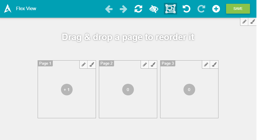
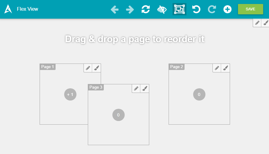
You can also use this mode to configure general properties of the FlexView like the autoplay mode to create a kiosk. To open the option modal click on the top right, on the edit button.
Click again on the button to exit this mode.