
Used as
-
Card
Summary
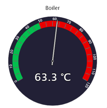
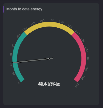
This card displays the live value of a Numeric point and can be highly personalized
Implementation
-
Add a card from the settings bar, and choose in the list Gauge
-
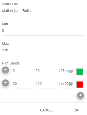
Fill-in the path to the point in valueOrd if the card is created from the setting bar
Flex Widget Properties
-
ValueOrd; The path to the NumericPoint to display. The destination must be a NumericPoint (or NumericWritable) otherwise it won't work.
-
Title: The title of the card
-
Min: Min value for the plotbands
-
Max: Max value for the plotbands
-
PlotBands: Color to apply for a particular range. They need follow the min and the max defined above.
-
PercentageMode: Whether to display a relative value in percent or not
-
IconOrd: Ord path of the icon to display
-
TitleSize: Size of the title in pixel
-
StartAngle: Start angle of the plotBands
-
EndAngle: End angle of the plotBands
-
ChartBackground: Background color of the chart
-
GaugeBackground: Background of the gauge
-
TitleForeground: Foreground of legends and axis
-
ValueForeground: Foreground of the value
-
DialBackground: Background of the dial
-
TickLength: Length of tick in plotbands
-
DataLabelY: The vertical position of the value