
Used as
-
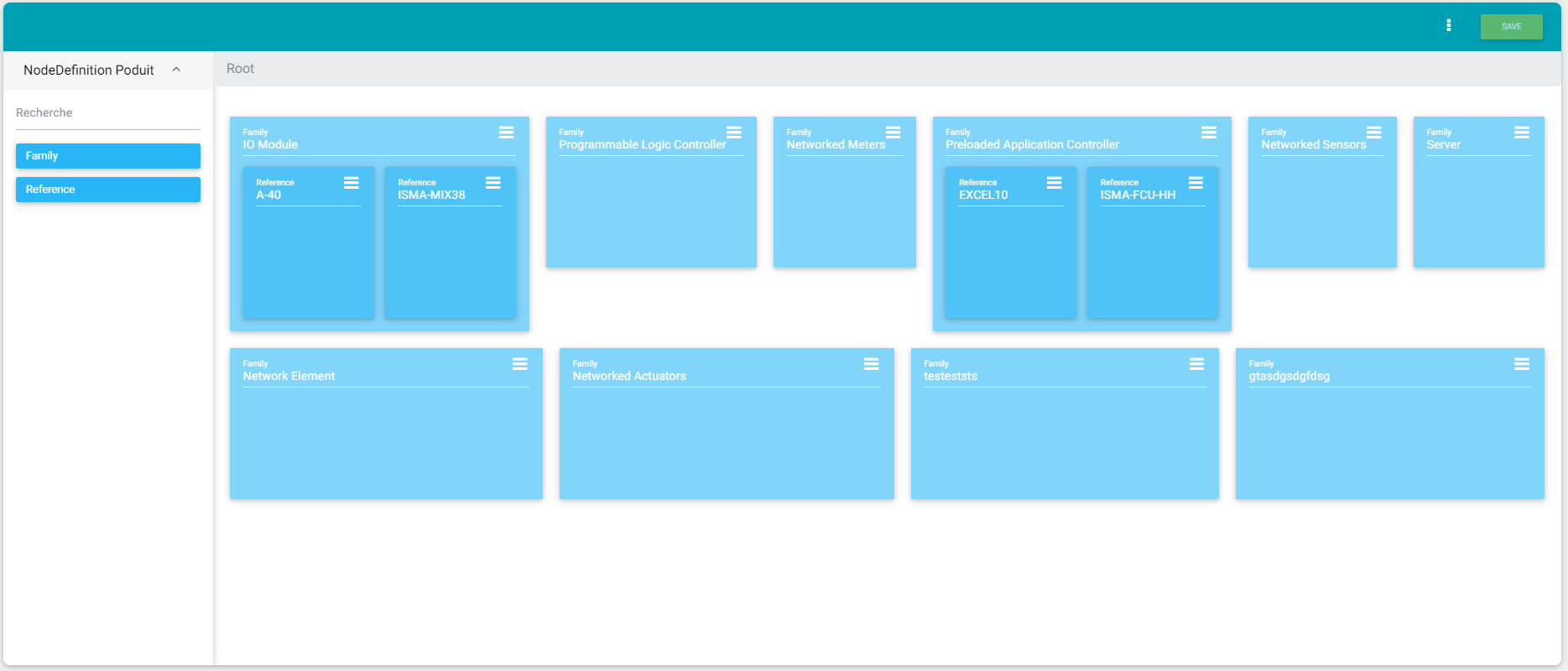
Card
Summary
This card allows you to display a NodeCreator.
Implementation
There are two ways to add it to the FlexView:
-
Add a card from the settings bar, and choose in the list NodeCreator
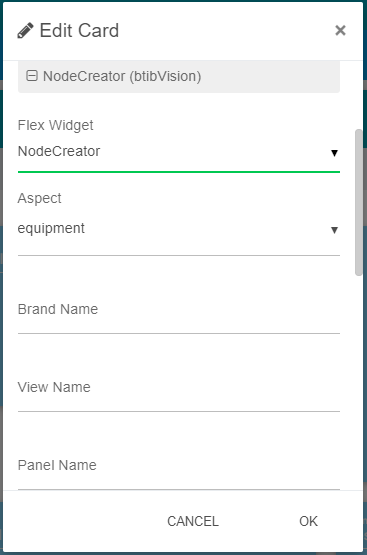
Flex Widget Properties
-
Aspect: The aspect to display NodeCreator from
-
BrandName: The brandName displayed at the left of the header
(information) SFormat is supported. -
ViewName: The viewName displayed at the center of the header
(information) SFormat is supported. -
PanelName: The name of the nodeDefinition panel
(information) SFormat is supported. -
Logo: The logo of the view
-
HeaderColor: The color of the header
-
FontColor: The font color
-
NodeDefinitionPanel: The type for the nodeDefinition panel:
-
Product: displays the image and the description of the nodeDefinition
-
Default: displays only nodeDefinition displayName (default behavior)
-
-
ShowOrphanNodePanel: Display or not the nodeDefinition panel