
Used as
-
Card
Summary
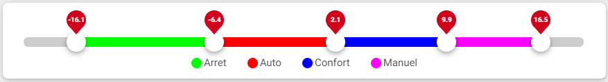
This Card displays a slider with multiple range, and allows to modify this ranges.
Implementation
There are two ways to add it to the FlexView:
-
Add a card from the settings bar, and choose in the list RangeSlider
-
Or drag&drop a component into a FlexView
Select some aspects to display
For those who wants to override the style of the RangeSlider, each parts have a specific class in css to be override. Look at the debugger of your web browser to find them, and use them in css part of style configuration.
Flex Widget Properties
-
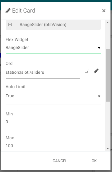
Ord: An ord path to a RangeSlider component in the station
-
Auto Limit: At true it will takes the min and max from the component in the station. At false it will takes the min and max from the card properties
-
Tooltip Background: The background color of the tooltips
-
Tooltip Mode: The way to display the tooltips (hover or always)