
A card can represent a px view, a chart, a text, a component view etc.
There are 4 ways for creating a card:
-
Use the add menu in the settings bar (at the top)
-
Drag&drop a card from the btibVision palette (among the list)
-
Drag&drop any component from the nav tree, which creates a ComponentViewer card
-
Drag&drop any px file from the nav tree, which creates a PxFileViewer card
Properties
-
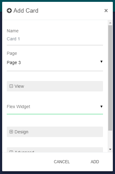
Name: The name of the Card.
-
Page: Location of the Card.
Flex Widget Properties:
-
Flex Widget: The Id of the Flex Widget to used.
-
The specific Flex Widget properties according to the model of cards
Layout:
* Flexbox
-
Flex Grow: See link.
-
Flex Basis: See link.
-
Align Self: See link.
-
Position: Defines the position of the Page in the Page.
Design:
-
Background: The background color.
-
Foreground: The foreground color.
-
Header Color Border: The left border color on the header.
-
Padding: The padding in px.
-
Shadow: Display or not a shadow around the Card.
Advanced:
-
Display: Defines if the Card is hidden or not. An SFormat condition that target a Component can be used (it's resolved with the FlexView target): if the Component exists and the user has operator read wright on it the Card will be showed, it will be hidden otherwise.
-
Header: Display or not a the header of the Card.
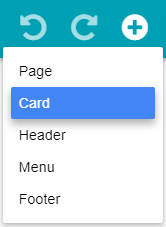
Add a Card from the menu
Click on Add button then Card.
Give a name to the card and select a Flex Widget in the list. The Flex Widget is the type of card you want to add. Fill-in the specific properties according to the selected flex widget, then click on Add.
Add a card from the palette
You can drag&drop a card from the palette, so you don't need to select the Flex Widget.
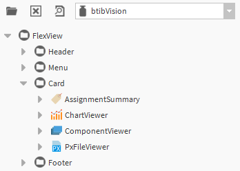
Add a card from a station component drag&drop
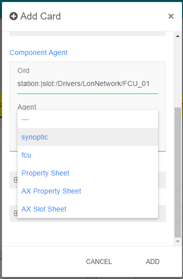
Select any component from the nav tree and drag&drop it in the palette. It will select automatically the type of card called ComponentViewer and proposes you to select one of the component's view.
Edit a Card
Click on Edit button on the right top of the Card.
You can modify the background directly by clicking on the Background button near the Edit button.
Delete a Card
Open the Edit modal of the Card and click on the Delete button on the top right of the modal.
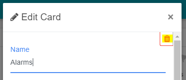
Then click on Yes in the confirmation modal.