A Page is included in the Slider. It's a container for cards.
Properties
-
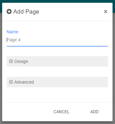
Name: The name of the Page.
Layout
-
Layout: The layout to use for displaying Cards { Flexbox ; Grid }Flexbox: The position and size of cards will be automatically handled based on the following properties. Use it when you want to display "full-space" cardsFlex Direction: See link.Flex Wrap: See link.Justify Content: See link.Align Items: See link.Align Content: See link.
-
-
Grid: The size and position of cards can be personalized. You need to define the layout for each size of the window because the view is responsive.Vertical Compact: whether to allow auto-switching of cards
-
Design
-
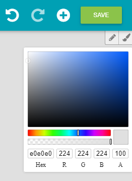
Background: The background color.
-
Padding: The padding in px (space between cards and the border of the page)
-
Column Gap: Sets the size of the gap in px between a Card's columns.
-
Row Gap: Sets the size of the gap in px between a Card's grid rows.
Advanced
-
Display: Defines if the Page is hidden or not. See Applying conditions on pages and cards
-
Position: Defines the Page position in the Slider
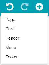
Add a new Page
Click on Add button then Page.
Fill in the modal that opened the required fields then click on Add.
Edit a Page
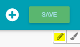
Click on Edit button on the right top of the Page.
Modify the required fields then click on Ok.
You can modify the background directly by clicking on the Background button near the Edit button.
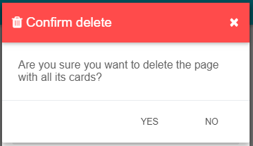
Delete a Page
Open the Edit modal of the Page and click on the Delete button on the top right of the modal.
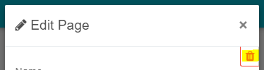
Then click on Yes in the confirmation modal.