
Description
The EnhancedBoundTable object is a WebWidget that displays the result of a BQL query in a data table. The widget has various features:
-
Instant search for values in the table.
-
Exporting data (.csv, pdf etc.).
-
Background display of the state of a "BIStatus" (including ControlPoint and Device). The color is updated automatically if the state changes.
-
Real time update of the displayed values.
-
Column order modifiable by simple drag and drop.
-
Sort function on each column.
-
Filter the number of values displayed with a paging system.
If your EnhancedBoundTable seems to have a styling and display problem, go to the "Styling" category below and follow the steps to select a theme.
Training
You can follow this e-learning course to practice
Implementation
-
Drag and drop the widget into a px.
-
Define the BQL query in the Query property. The query can be defined from a path in the station or be relative.
-
If the query is relative, enter the path of the component used to resolve the query into the Ord property of the WbViewBinding.
Properties
-
Query: BQL query to resolve. The query can be defined from a path in the station or be relative. The EnhancedBoundTable is compatible with the following schemes:bql: station:|slot:|bql: select displayName, slotPathOrd from baja:Component or on the alarm space station:|alarm:|bql: select *history: station:|history:/import/temperature?period=monthToDate
-
Icon : Add an icon with an ord in the first column.
-
Show Point Type Icon : If the point has one of the basic types (numeric, boolean, enum, string), a column is added with the type logo.
-
Hyperlink: Indicates the relative path (slot: scheme) to open the target when double clicking on a line by binding to the target component (e.g. to open the parent component: 'slot:../').
-
Hyperlink Mode: Indicates how hyperlink will open, (replace, new shell, modal, new tab, dropdown, no hyperlink). Dropdown mode gives access to basic actions with a dropdown menu on the point when clicking on its line.
-
Dropdown Hyperlink Mode : The action of the detail button in the dropdown when the mode is activated
-
Row Count: Specifies the number of rows visible by default (-1 to display all).
-
Show Column Selector: Displays a button to manage the visible columns. This allows you to directly hide some of the table columns.
-
Show Exporting: Displays the export button (this feature is only available in the browser). It allows data to be exported in CSV or PDF, to print the table or to copy its contents into the clipboard.
-
Show Info: Whether information on the number of lines is displayed or not.
-
Show Refresh: Displays a button to refresh the table.
-
Show Row Count Selector: Displays a drop-down menu to change the number of visible rows.
-
Show Searching: Displays the search field to filter the values in the table.
-
Show Custom Search Builder: Displays the enhanced search field, a complex request builder.
-
Show Selection: Displays a column of checkboxes to select lines. Useful with some other cards (ex: MultiPointCommands)
-
Subsciption: Live update of components displayed in the table.
-
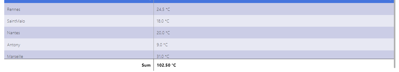
Show Table Calculator: Show a footer with the sum of the rows added in the "Table Calculator Columns" fields. (cf Sum)
-
Table Calculator Columns: Name of the column with Sum computed. (case and accent sensitive). (cf Sum)
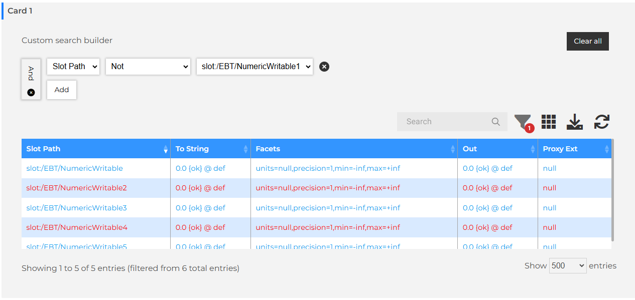
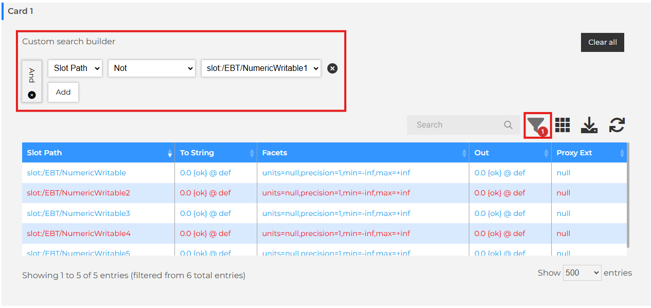
Custom search builder
SearchBuilder adds user defined complex search to the DataTable with the capability to search the DataTable by creating groups and conditions. It is possible to set logic types for groups and apply a variety of conditions.
SearchBuilder allows users to construct a search query by adding groups and conditions to a graphical interface that is clear and easy to follow. Already built in to SearchBuilder is a series of conditions that can be applied to all of the data types recognisable by DataTables. SearchBuilder automatically recognises the column type and presents the conditions that are available for it. These, of course, are all fully customisable to fit your needs and can be extended for custom types as required.
By default, the SearchBuilder is hidden. The filter button is used to show/hide the SearchBuilder. The filter button also display a badge with the number of criteria added in the SearchBuilder.
DropDown
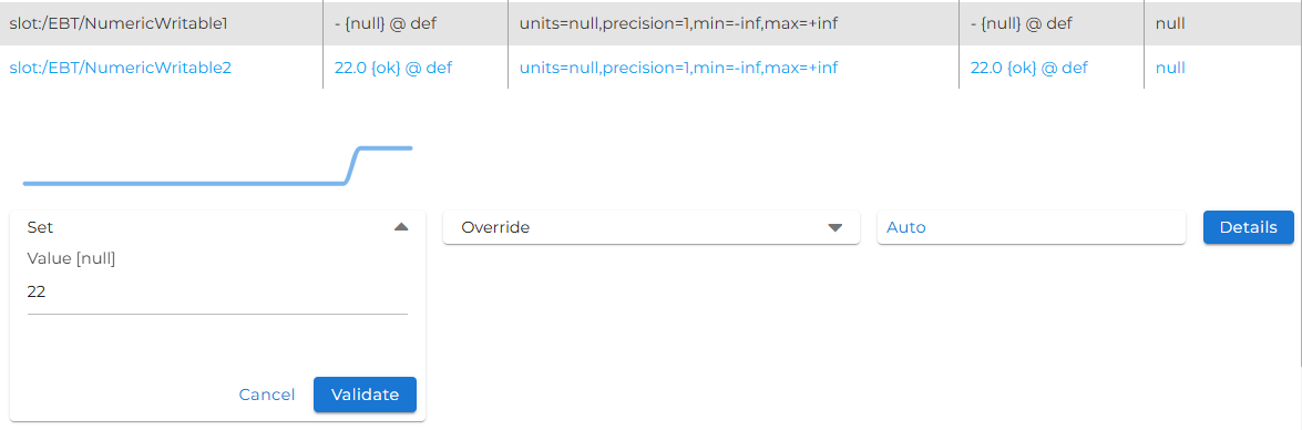
By selecting Dropdown in the hyperlinkMode, the row will display possible actions on the point. It only works for ControlPoint.
A tendency is displayed for NumericPoint that has an n:history tag.
Sum
A line can be added to display the sum of certain columns. To do this, simply enter the column names (case-sensitive) in the “TableCalculatorColumns” property. If the EnhancedBoundTable results do not share the same facets, the units will not be displayed.
Styling
-
In the Theme category in the card edition, select a palette from the drop-down menu.
-
If you want to customize the styles you can modify them by pulling down the "Colors" tab.
Notes
-
Automatic updating of values does not work in the following cases:If the "displayName" changes.If a value other than a direct field of the component targeted by the request changes (e.g. parent.name).If the name of a component changes, the Ord of its children will not be updated.If a non-displayed component is modified. (It will not be present in queries until it has been displayed, so it will therefore be necessary to reload the view)